💎 How saying it strange can make it more memorable

Say it strange

Why did Apple say ‘Think different’ and not ‘Think differently’? Why did they follow this with ‘The funniest iPod ever’ rather than something like ‘The most enjoyable iPod we’ve ever made’? Why does Aleksandr the meerkat – spokes animal for price-comparison website comparethemarket.com – say ‘Simples’ and not ‘Simple’? Why did 7UP promote itself as ‘The Uncola’? Why did Budweiser decide ‘Whasssup”’ was the perfect way to build their brand? We’ll tell you why: they’re all examples of a linguistic quirk used to create a mighty meme. By twisting language just, a little they achieved maximum memorability. It’s a powerful technique but be warned, it’s easy to get wrong.

Excerpt from: Read Me: 10 Lessons for Writing Great Copy by Roger Horberry and Gyles Lingwood

💎 The full text of the 1996 Apple Think Different ad

Here’s to the crazy ones. The misfits. The rebels. The troublemakers. The round pegs in the square holes. The ones who see things differently. They’re not fond of rules. And they have no respect for the status quo. You can quote them, disagree with them, glorify or vilify them.

But the only thing you can’t do is ignore them. Because they change things. They invent. They imagine. They heal. They explore. They create. They inspire. They push the human race forward. Maybe they have to be crazy.

How else can you stare at an empty canvas and see a work of art? Or sit in silence and hear a song that’s never been written? Or gaze at a red planet and see a laboratory on wheels? We make tools for these kinds of people.

While some see them as the crazy ones, we see genius. Because the people who are crazy enough to think they can change the world, are the ones who do.

Excerpt from: Actionable Gamification: Beyond Points, Badges and Leaderboards by Yu-kai Chou

💎 On selling something surprising (make it familiar). On selling something familiar (make it surprising)

But by using familiar form, TiVo mad people more comfortable adopting radical innovation, By hiding the technology in something that looked visually familiar, TiVo used similarity to make difference feel more palatable.

Many digital actions today visually evoke their analog ancestors. We click on the icon of a floppy disk to save documents and drag digital files to be thrown away in what looks like a waste bin. Visual similarity also shows up offline. High-end care often use fake wood grain on the dashboard and veggie burgers often have grill marks. All make the different seem more similar.

The opposite also holds. Design can be used to make incremental innovations feel more novel. When Apple introduced the iMac in 1998, it featured only minor technological improvements. But from a visual standpoint it was radically different. Rather than the same old black or grey box, the iMac was shaped like a gum drop and came in colors like tangerine or strawberry. The device was hugely successful, and design, rather than technology, created the needed sense of difference that encouraged people to purchase.

Excerpt from: Invisible Influence: The Hidden Forces That Shape Behavior by Jonah Berger

💎 On the power of being specific in ads (Apple and the iPod)

My favorite example of the power of specificity was Apple’s introduction of the iPod. They didn’t give it the vanilla, global “World Class MP3 Player” treatment. They said “1,000 Songs In Your Pocket.” They were specific. They talked about the virtues of the product, not wooly melodramatic horseshit.

My direction to the creative teams who worked for me was always the same – be specific. Today the objective is to ignore the specific and “ladder up” the benefit.

Excerpt from: 101 Contrarian Ideas About Advertising: The strange world of advertising in 101 delicious bite-size pieces by Bob Hoffman

💎 On talking to the audience in their language (not yours)

Horse Power was comparison everyone could understand.

Suddenly, Watt had put the steam engine into a language that made sense to the layman. Which is exactly what Steve Jobs did when he launched the iPod.

He didn’t compare it to to other MP3 players for speed and fidelity.

That would have been a market-share comparison.

Steve Jobs had a much bigger opportunity in mind, market-growth.

That’s why he compared the iPod to something ordinary people could understand.

He simply held it up and said “A thousand songs in your pocket.”

Because 200 years later the rules for creative communication haven’t changed. You talk to the audience in their language. Not yours.

Excerpt from: Creative Blindness (And How To Cure It): Real-life stories of remarkable creative vision by Dave Trott

💎 On the disease of thinking that having a great idea is 90pc of work (as Steve Jobs notes)

You know, one of the things that really hurt Apple was after I left, John Sculley got a very serious disease. It’s the disease of thinking that a really great idea is 90 per cent of the work. And if you tell all these other people “Here’s this great idea”, then of course they can go off and make it happen. And the problem with that is that there’s just a tremendous amount of craftsmanship in between a great idea and a great product… Designing a product is keeping five thousand things in your brain and fitting them all together.

Excerpt from: Curious: The Desire to Know and Why Your Future Depends on It by Ian Leslie

💎 On anchoring in practice (at Apple)

The same approach can be used to communicate initial product value. Steve Jobs used anchoring during the launch of the Apple iPad to such effect. At one of his fames launch presentations, he introduced the “rumoured cost” that was speculated to be $999. This information anchored the press to the notion this would be the high-priced product. However, when Jobs later in the event revealed the iPad to be priced at $499, this “anchoring and reveal” tactic created a notion of value for money.

Excerpt from: Northstar

💎 On our tendency for lower comprehension of texts when read online versus in printed media (keep it simple)

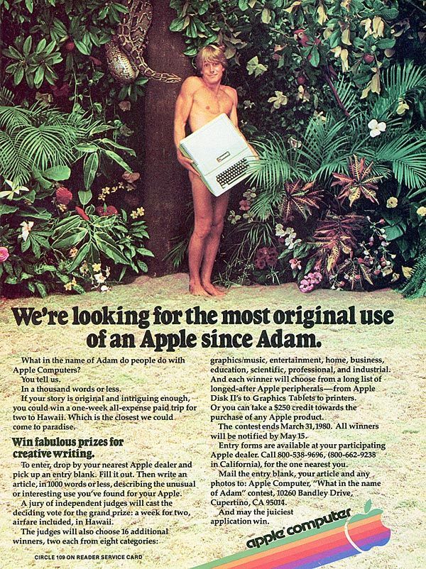
In 1985, at the dawn of the computer age, the psychologist Susan Belmore conducted a simple experiment on twenty undergraduates at the University of Kentucky. The students were exposed to eight different short texts and then asked to answer a series of questions about what they’d just read. Four of the passages appeared on paper (a sheet of white bond, single-spaced, forty-seven characters per line) and four appeared on the monitor of an Apple II Plus 48k computer. Belmore was curious if reading the text on a screen might influence both the speed of reading and levels of comprehension.

The results were depressing, at least if you were an early adopter of computer technology. “These data indicate that reading texts on a computer display is not equivalent to reading the same texts on paper,” Belmore wrote. “Overall, college students took 12 percent longer to read and comprehended 47 percent less with computer-presented text.”

Excerpt from: The Smarter Screen: Surprising Ways to Influence and Improve Online Behavior by Shlomo Benartzi and Jonah Lehrer